Sunday, July 20, 2008

Red, White, and Blue

We wanted to get our old friends and their families together so we decided to throw a BBQ. And because it was Alisha, Cheri, and I hosting, of course we went all out.
Cheri found the recipe for this drink last year (from Family Fun?) and has been dieing to try it. Looks really impressive right? We thought so :) It's not too hard to make.
Recipe:
-fill glass 1/3 full with ice cubes and pour in cranberry juice (we found that less than a 1/3 full with the juice worked best)
-add more ice cubes (up to 2/3 line) and pour in blue Gatorade
-add more ice cubes and pour in DIET Sprite
Easy! The whole premise is that the differences in sugar content keep them layered like that. So theoretically you could do this with any number of drinks as long as the one with the largest sugar content is on the bottom and the least sugar is on the top. The only problem with these is that they don't taste all that great. As you are drinking it you taste each one individually and while that may be ok it just doesn't taste like a party drink. Ah well - guess we will keep experimenting with other, better tasting ones and see what we can come up with.
I just have to do my "heights" on the tables. It my favorite table-scaping trick. Just put a few boxes under the tablecloth and you're done.
These are our party favors. We filled them with enough graham crackers, marshmallows, and chocolate for each family to make their own smores at home. (We didn't dare do a campfire with that many kids running around)
The table decorations were pretty easy. Pretty scrapbook paper inside cylindrical vases. A chunk of floral foam inside holds the flags. Simple, elegant - yay! I was thinking afterward that we could have added bows but didn't get around to doing it before the party.

Saturday, July 12, 2008

Explosion Box

I'm in a blogging mood today so here is one more. This is an explosion box I made for Sam for Christmas while he was gone.

Here are the pages before I put it all together.
Once it is all put together, when you pull the lid off it all kind of pops open and you can flip through the pages.
Ok I am updating this with instructions for anyone that would like to try it themselves. Sorry I didn't take photos as I put it together but hopefully I can explain everything clearly enough without them. For all of you who are extremely impressed, no I didn't come up with this concept. I am simple recreating the directions I followed. Feel free to ask questions if you get stuck.
-You will need 4 double sided cardstock weight papers.
-The first paper (the one that will be the outside of the box, and the base layer of the photos) should be 12 inches by 12 inches. You will need to score the paper 4 inches in from all 4 sides, and cut out the corners (4x4 squares).
-The next paper trim to 11x11, and score the sides at 3 3/4 inches. Cut out the corners.
-The third paper needs to be trimmed to 10x10. You should score the paper at 3 1/2 inches on each side, and remove the corners.
This will leave you with 3 perfectly layered pieces for your box.
-Embellish and add photos wherever you wish- except the center sections on the largest and middle sized layers. After embellishing, you will attach the layers together at this point.
-The final piece of cardstock is for the lid. Trim your paper to 8x8 inches. Score the edges at 1 and 7/8 inch. This time, only cut one side of the square on the edge. Glue the flap you have created to the inside of the lid. Flip it over, and embellish.

Scrapbook Sketches


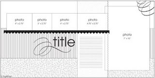
My latest (and so far best) cure for scrappers block has been using sketches. My problem has never been picking out the photos or the paper but in feeling creative enough to pull together the layout. And sketches are able to give me a jump start. So I now spend much less time sitting and staring at my pages :) I discovered this a while ago but wasn't blogging at the time. I figured some of you may appreciate the inspiration as well. And no, I don't have a problem feeling like it isn't completely "my work." Sometimes I follow the sketches pretty closely and others I just use bit and pieces, but it's always my own interpretation. And I'm always much happier with these than the ones I have come up with on my own on those days that the ideas weren't flowing.

Here is an example of a sketch. It came from pagemaps.com. That's my favorite site for sketches but there are plenty of other great sites out there.


my interpretation

oh, I wanted to point out that the above layout is also one of my new ideas in action (ok not all My Idea, I stole it but still.. :) ). I want to create a page each year that kind of sums up the year before for each child. I plan to use the same sketch each time to tie them together. And I plan on putting them in their Birthday Book (which I have only just begun to work on - 8 pages down so far!).

and a few other layouts I've put together recently from sketches


the pg on the right is from a sketch, the one on the left I created on my own to work with it.

Circle Sketches


This is one of my new(ish) favorite scrapbook techiniques. I already had an obsession with circles and polka dots on pages and this just feeds into that. I really love how they turn out.

I just start with a sketch like this

And here is the layout!


Another one of my favs.


Maybe one day I'll be good enought to make up my own sketches.